With our focus on mobile-first web design, Perception utilizes Bootstrap – a front-end framework for creating sites for small screens, then scale designing up from there. This allows us to use the most modern website design techniques so you can be sure your site works on all devices, browsers, screens and provides the best user experience to each and every visitor.
At Perception we work with you to create a consistent user experience across all devices, a concept proving more and more important as website traffic continues to increase from mobile devices as it diminishes from desktops. We design for the smallest screen first, then build upon that foundation for larger screens – delivering the right user experience to the right device.
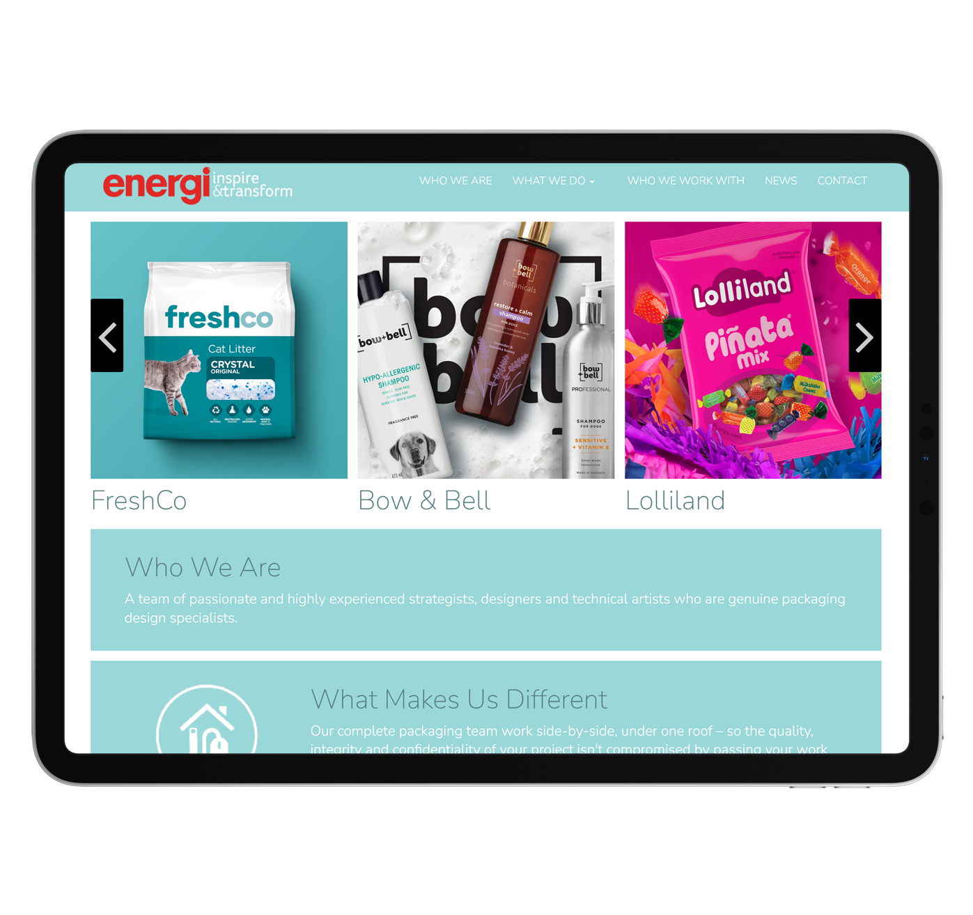
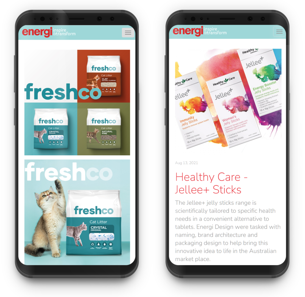
Energi.com.au needed to showcase their product designs in an easy and effective way. Utilizing mobile-first design concepts, Perception built a marketing showcase website Energi can show customers on any device.
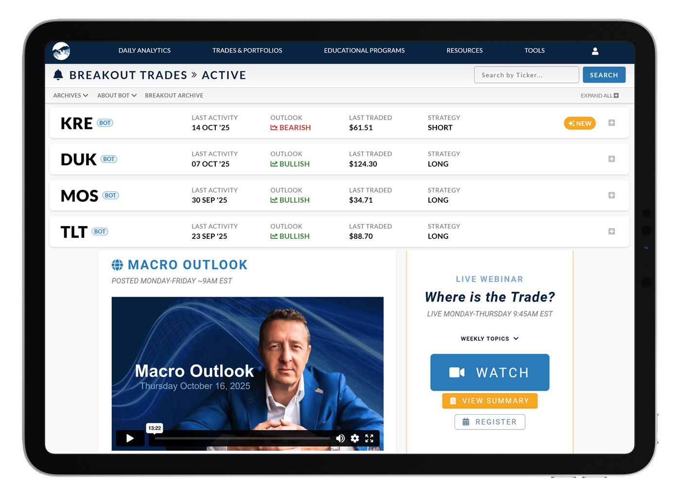
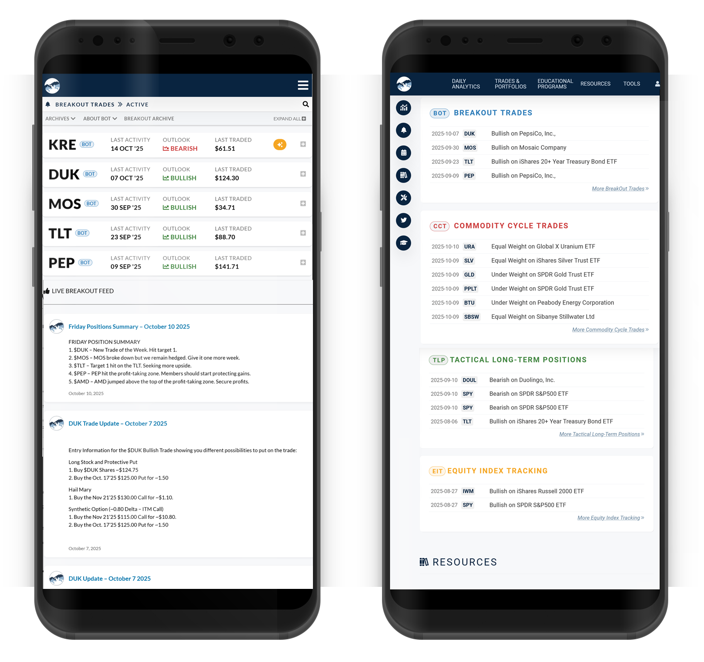
Big Picture Trading is a membership web application that allows access to timely information and executable transactions. Perception designed a membership portal that is clean and allows quick access to important information. Using Big Picture Trading branding Perception designed specialized templates so everything works seamlessly.
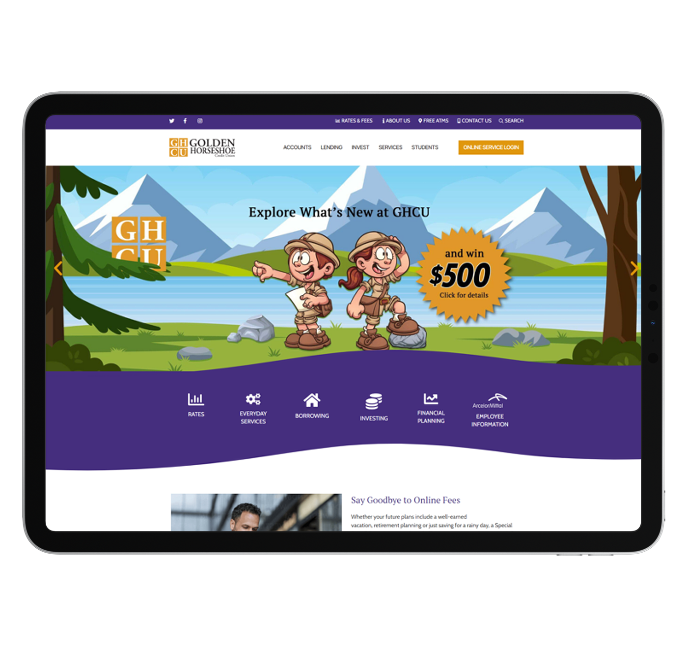
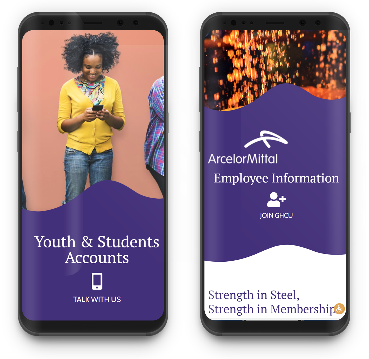
Golden Horseshoe Credit Union needed a new site that focused on a mobile-first design and a modern aesthetic. With that in mind, Perception created a fresh, dynamic new site with the user experience first and foremost in their vision. Complemented by a new secure online Loan Application and Membership Application, the team was able to give GHCU an online experience that will help them to build upon their already successful membership.
Many of our legacy clients update their website every few years and take advantage of Perception's design team to create beautiful and engaging modern websites that promote both their brand and company vision.

